Typography
RTFM
2025/05/24 23:44 Filed in: Advertising / Digital
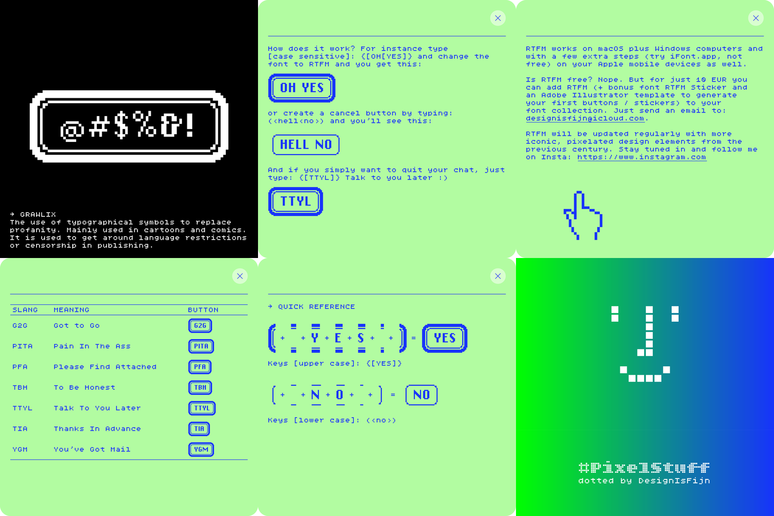
In 1984 Susan Kare worked on the first version of Apple’s revolutionary graphical user interface. She began by sketching arrows, buttons, pointing hands, and other visual elements in a notebook. These casual prototypes of the new, user-friendly face of computing were initially drawn with a pen on graph paper, each square representing a pixel.
For long I am fascinated by internet slang and ASCII emoji which unstoppably infiltrated our digital communication. These sequences worked as a short code in several forums and chatrooms. RTFM (yes, Read The Fucking Manual) combines both worlds. Use it to quickly generate custom UI buttons. Instant fun for T-shirts or social media stickers! (Try Sticker Maker.app, it’s free)
RTFM works on macOS plus Windows computers and with a few extra steps (try iFont.app, not free) on your Apple mobile devices as well.
Is RTFM free? Nope. But for just 10 EUR you can add RTFM (+ bonus font RTFM Sticker and an Adobe Illustrator template to generate your first buttons / stickers) to your font collection. Just send an email to: designisfijn@icloud.com.
RTFM will be updated regularly with more iconic, pixelated design elements from the previous century. Stay tuned in and follow me on Insta!
Download a type specimen in PDF format.
Bless this mess
2025/01/01 19:48 Filed in: Event / Illustration

My pixels took a break until 6 January. Best wishes for the new year!
Bless this mess. The inspiration for these three words in ‘cross stitch’ (pixels are fun to play with!) comes from a publication I have recently made for the Scientific Council for Government Policy with the—revealing nothing—title The Netherlands in a Fragmenting World Order.
A two kilo wrecking ball …

You are 30 times more likely to die from a falling coconut than from an attack by a shark …
- Coconut: 150 deaths/year
- Shark: 5 deaths/year
Evolution of a logo

Design is an iterative process: explore, try, share, test, reject … and start over again. This cycle approach stimulates progressive insight.
The concept ‘design = fijn’ [Dutch for ‘fine’] has become an integral part of the philosophy underlying all my work: for people who appreciate fine design. My fascination for mechanical typewriters, monospaced fonts, ASCII art and emoji, led to the logo design.

An early version from 2015 to 2018 and now (early) in 2024.
Caffeine & Sugar

Doctors say we should consume no more than 300 mg of caffeine per day and between 90 and 120 grams of sugar per day. What about our drinks?
Cheers!
2020/10/17 15:24 Filed in: Illustration
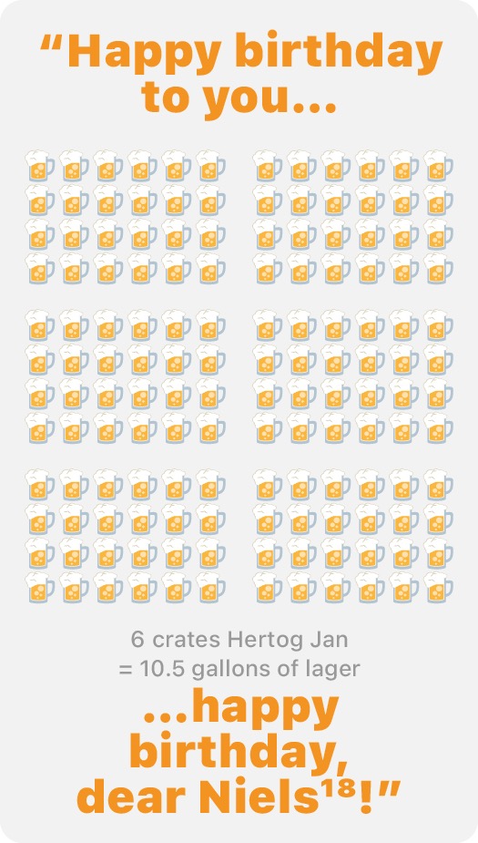
Infographic of the month: Just unbelievable! [No further comments]
Dienstfiets [part I]
2020/07/19 15:14 Filed in: Graphic Design
I have made this infographic [proposal] for TNO back in 2017, but an actual fact still is: traffic jams clutter our overcrowded country. The solution for commuters is quite simple and healthy: Step on a bike once and a while!
